Posts tagged interior design
Lighting, Lighting, Lighting!
 
Photos Roll & Hill
 

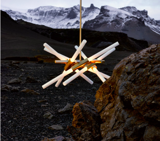
An empty box can feel chic if you light it correctly. Here are simple tips and inspirations: 

 1) The Trifecta: Remember the three prongs of lighting: Ambient, task and accent. Start with your ambient and then address accent and task as needed.  

 
Screen Shot 2018-10-17 at 3.11.45 PM.png
Screen Shot 2018-10-17 at 3.11.56 PM.png
 

2) Dimmers or Death: Getting the dimmer settings right is essential to a properly lit room. For some reason, people often make this an after thought, but it should be just a regular thought. Sometimes the newer high tech switches can get a little confusing, so make sure you understand them so you don’t have to brush your teeth in the dark. .  

3) Be Shady: High quality lamp shapes and picture lights can get expensive, but nothing makes a room look like a few million bucks than really quality fixtures.

 
Screen Shot 2018-10-17 at 3.11.56 PM.png
Screen Shot 2018-10-17 at 3.12.03 PM.png
 

4) Manage Your Bulb Guilt: “I want to go energy efficient … but … nothing glows (or dims) like incandescents.” It’s true, but the new bulbs are just so, so much better for the earth and are looking better all the time. Their soft whites are getting very close. And they have dimmable versions as well. If you can leave the incandescents to just one or two figures, pretty soon you won’t miss them.

 
Screen Shot 2018-10-17 at 3.37.10 PM.png
 

5) Lighting Hacks: A fun and easy way to avoid costly electrician bills are to get smart lights that are controlled with a phone app. Phillips Hue makes a nice set that connect to your wifi. No wiring needed. The lighting schemes are infinite and they are really nice transition into the smart home universe.


Welcome to Aspen's Newest Supper Club: 7908 - KD's Latest Design
 
7908_Aspen_Restaurant_KDDesign


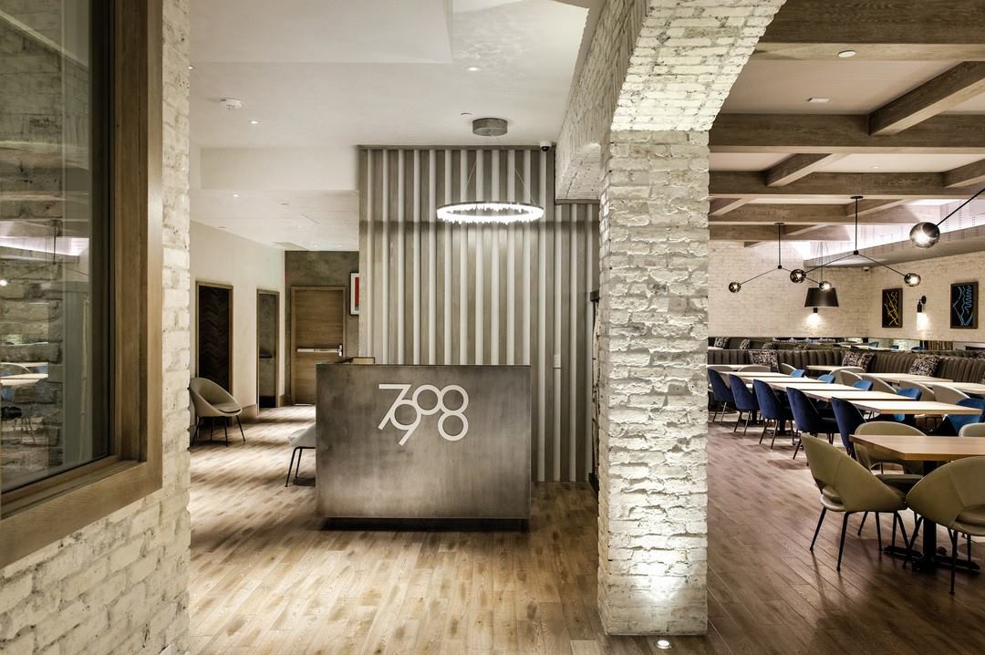
Located at Number 415 on the Hyman Mall –and 7,908 feet above sea level – is Roger Wilson’s new supper club with food by Chef Charif Souki and design by Kristin Dittmar … that’s us. Big enough to accommodate a restaurant, bar and night club, the supper club opened in July and is resting up for the winter season. 

With almost 6,000 square feet to play with, my challenge was to make the room feel grand, but also create plenty of cozy spots. For example, I made sure the lady-finger banquettes had nice deep corners for friends to snuggle while they enjoy an order of the already famous caviar nachos. 


7908_Aspen_NightClub_KDDesign
 
 
7908_Aspen_Restaurant_KDDesign


Some of my other favorite details include:

  • A custom “dance box,” sort of a “stage for one” just off the DJ booth.

  • Special tables in the night club that can be raised and lowered to accommodate eating, drinking, and late-night dancing. Mind the heels girls!

  • Perhaps my favorite detail is in the one room I never get to visit. The men’s room floor is done in black and white marble tiles which I had specially cut to look like a plaid carpet – just something for the boys to appreciate when their glancing down.  


Pondering The Clean Lines in Your Home? You Have the Japanese (and 19th-Century Germans) To Thank
 
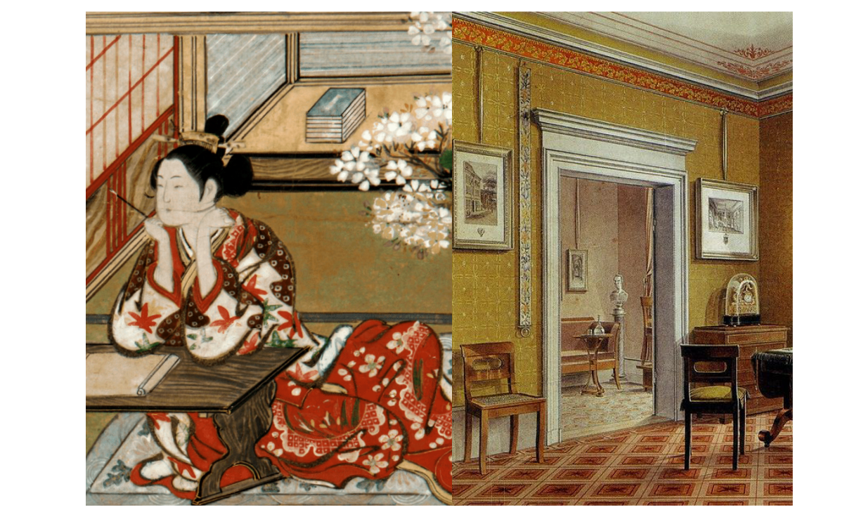
Painting from The Tale of Genji (c. 1021) and a 19th Century German living room in the Biedermeier style.  

Painting from The Tale of Genji (c. 1021) and a 19th Century German living room in the Biedermeier style.  


Vogue editor Diana Vreeland had something of an obsession with Japanese culture. As she put it, “God was fair to the Japanese. He gave them no oil, no diamonds, but he gave them style.”  Indeed, their fondness for clean and harmonious lines dates all the way back to the early 14th century when the original tatami rooms came into style. It only took Europe 500 years to catch on. Well, not exactly ...
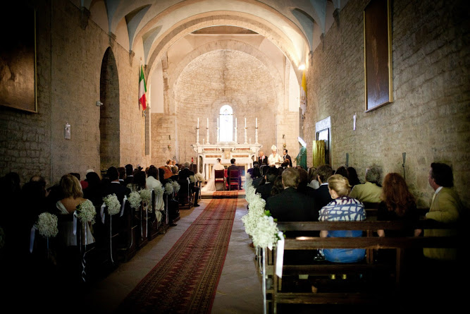
Not much has changed by way of Japanese interiors since the 14th-century: The lovely Masuya Yushinan Hotel carries on the tradition.  

Not much has changed by way of Japanese interiors since the 14th-century: The lovely Masuya Yushinan Hotel carries on the tradition.  

Biedermeier furniture on 1st Dibs

Biedermeier furniture on 1st Dibs

There was at least one movement in the early 19th century that valued form over ornament. Called Biedermeier, the furniture style was popular in Germany from 1818 - 1848. A burgeoning middle class started decorating their new and improved homes with a new style that emphasized clean lines and minimal ornamentation. The philosophy was in line with their sensible, utilitarian values, but the results were quite beautiful. To the modern eye, they look traditional, but it really was a radical departure from the incredibly ornate stylings of the time. 

Biedermeier furniture
 
 
Summer Chairs for Summer Lounging
 
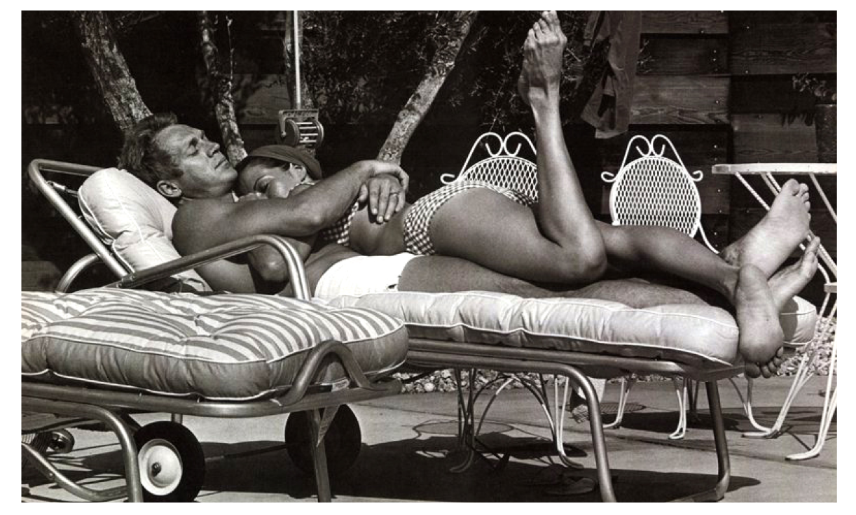
Steve McQueen cuddles with his wife, Ali McGraw in the mid '70s

Steve McQueen cuddles with his wife, Ali McGraw in the mid '70s


It’s time to get outside and enjoy that warm air. What makes the out-of-doors even more enjoyable is some great furniture. Whether you're poolside or mountainside, here are a few chaises, loungers and side chairs to inspire your pleine air dreaming. 


The Outdoor Sofas


Outdoor Furniture2.png


The Light Woods

 
Outdoor Furniture3.png


The Basket Weave Lounger

 
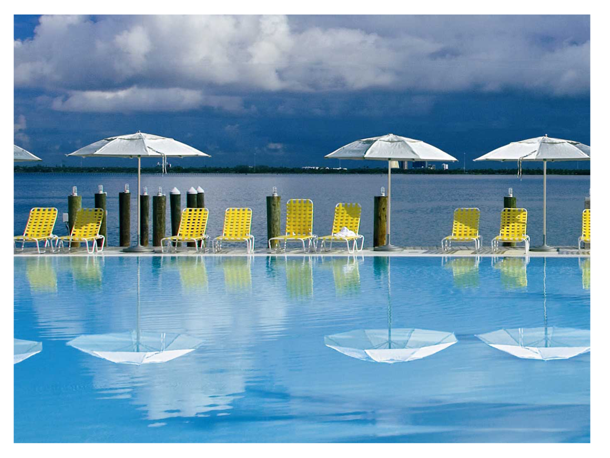
The Standard Spa, Miami Beach 

The Standard Spa, Miami Beach 


The Adirondacks

 
Outdoor Furniture5.png


Color for When You're Getting Color

 
Outdoor Furniture6.png


Summer is for Sharing

 
Double.png


Spagetti Straps

 
Outdoor Furniture9.png


The Floats 

Outdoor Furniture10.png

From Victoria Beckham's Instagram to yours, have a great summer! 


Tips from Tipis
Tipi-Slides2.png

Interior Design can learn a lot from the Native American Tipi – Dakota from ti, “to dwell” and pi, “to use.” (talk about all-natural, locally-sourced materials.) The Ute (Aspen’s native peoples) use the word tipi, as do the Lakota, but the older word is tipestola, “she or he lives in a sharp pointed lodge.” Blackfoot people call it niitoyis; the Kiowa, do-heen

As the legend goes, after First Man and First Woman were created, the Creator designated a Helper to look after them. When winter blew in and the people were cold, the Helper, inspired by a rustling Cottonwood leaf, gave him the idea for the tipi, which is basically a large leaf wrapped into a cone. The Helper made the tipi not just shelter, but a home, with a facade upon which people would paint their dreams, and a smoke hole to see the stars.  

Left: Did you know that the door of the tipi is always faced towards the East to greet the morning sun?  Bottom right: A more modern-inspired tipi design. 

Left: Did you know that the door of the tipi is always faced towards the East to greet the morning sun?  Bottom right: A more modern-inspired tipi design. 

Tipi: Home of the Nomadic Buffalo Hunters, written and illustrated by Paul Goble is a beautiful archive of traditional tipi designs. With a deep knowledge of archival black and white photos – and a bit of creative license – he has illustrated these magical abodes in vibrant colors, elegant patterns and strikingly modern designs.

Inspiration can come from anywhere. 

 
"THESE ARE A FEW OF MY FAVORITE THINGS..."

Event Synopsis:

HIGH POINT MARKET, NC.

High Point Market was the high point in my fall. Hosted in North Carolina, the biannual event is the largest furnishing trade show in the world, spread over 180 buildings encompassing 10 million square feet of things I love: textures, patterns, colors, prints, structure and making space livable and lovable. 

This trade show didn't just come out of nowhere; in 1909 the first Southern Furniture Market took place over two weeks and has been held in some form ever since (except at the end of World War II). People come from all over the world for it, and after attending for my first time I now know why. 

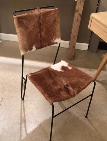
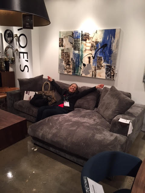
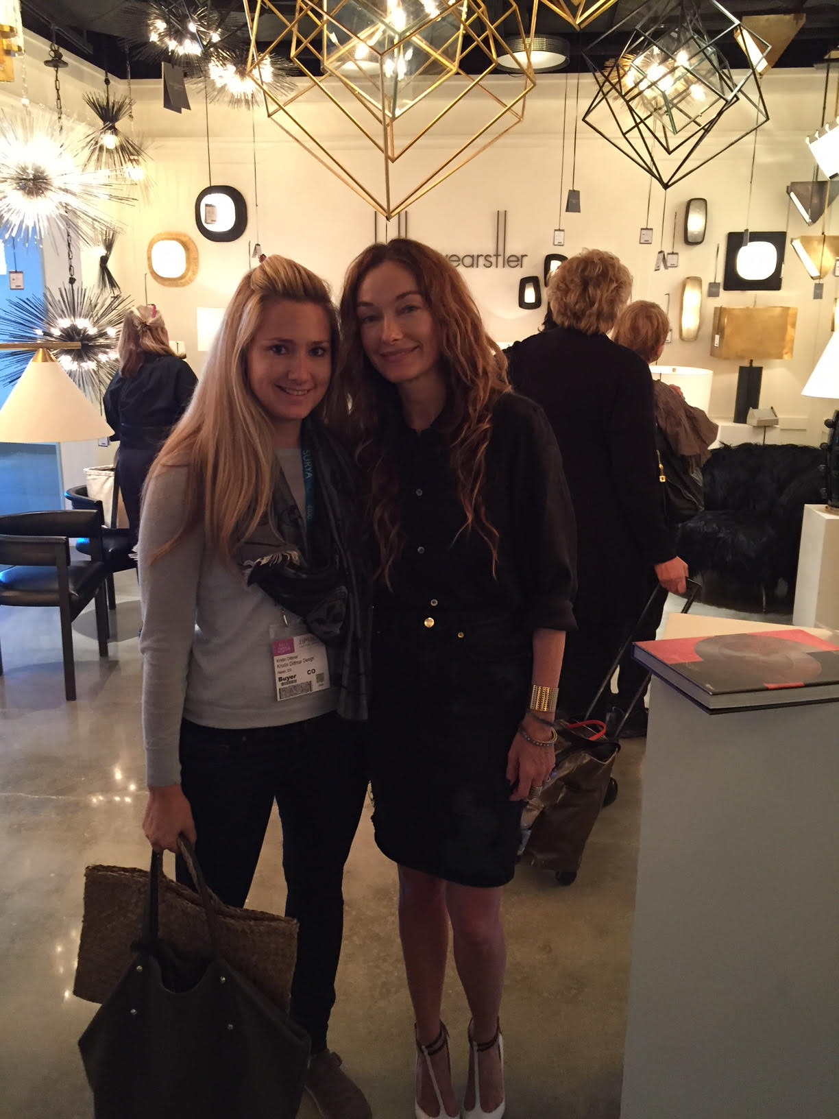
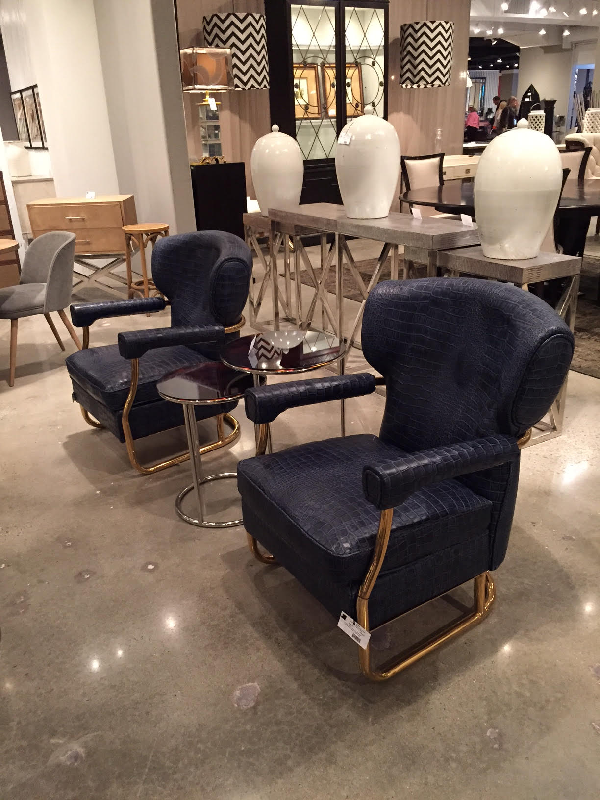
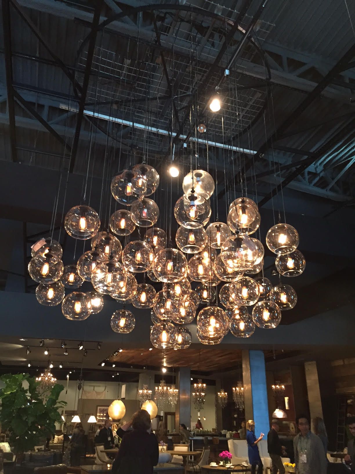
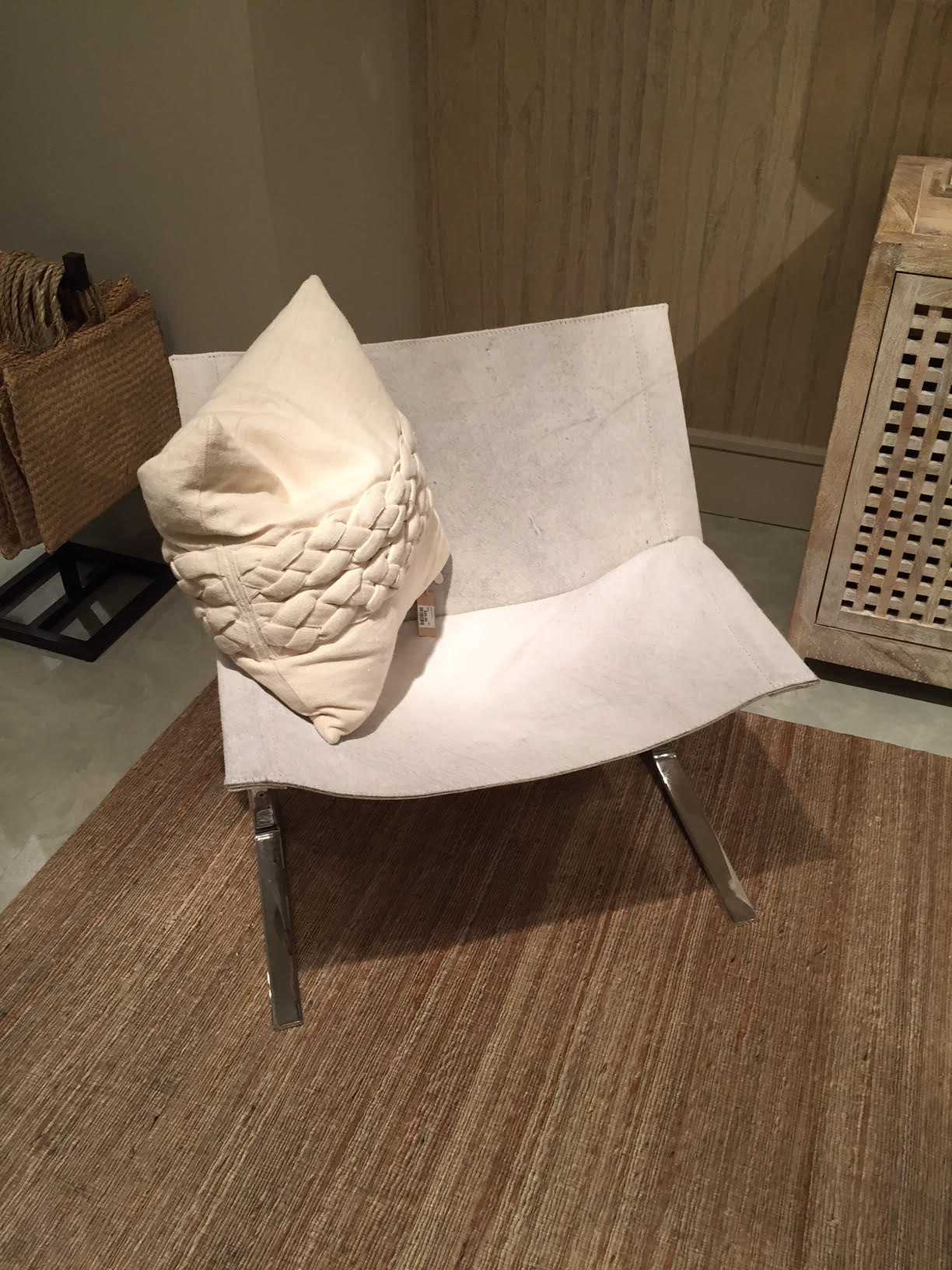
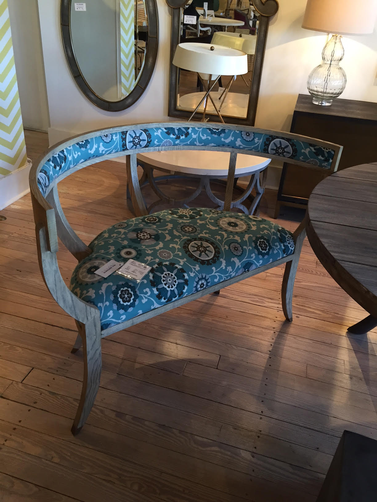
I travelled to the southeast in early October for the event, and still feel inspired by it today. Highlights from High Point include a book signing with Kelly Wearstler at Visual Comfort (she's one of my icons!) and a fringe chair from McGuire and Baker. Some other great stops were Four Hands, Moe's, and Arteriors (mixing art and interior design, just like it sounds). I'll let the pictures speak for themselves. Just click on the photo to scroll through the gallery, and scope out what's new in interior design.   


Transforming Tents

It’s the summer of tents in Aspen. It seems like every party, wedding and reason to celebrate is taking place under a temporary structure. And while tents are nothing new, the decorations going into making them seem so un-tent-like are.

During the Food & Wine Classic in Aspen, the grand tasting tents go up in Wagner Park to protect people while they drink and eat their way through hundreds of wineries and food purveyors. But away from the center of the action, smaller tents for seminars and private parties steal the spotlight. Nice touches in these included red-and-white checkered tablecloths for a seminar on picnicking. At night, private tasting events were transformed into ultra-cool lounge settings with low, cushy couches and brightly colored accent throw pillows.

Mid-summer is also a time for galas. Many of the nonprofits in town host their annual benefits, and they go all out in making it a luxe affair. Understated elegance has been the theme here, again with thoughtful, intimate touches; long picnic tables, small sofa sets around oversized tables and tall-boy tables with stools all encourage conversation and provide a sense of community at events that can otherwise be stuffy. Gone are big round tables for 10. Instead event planners are moving toward a mix and match of tables and group sizes.

And finally, what summer isn’t complete without weddings? Some of the most interesting designs have been on the walls surrounding these lavish events. Instead of keeping the ceiling white, one bride covered the ceiling with large swatches of navy-blue-striped fabric. In a separate tents, light blue plaid hung from the walls while the ceiling was covered in painted in stars and moons. It was heavenly and truly transformed the space into a mystical place. Spotlights pointed toward the wall casting shadows of stenciled leaves and flowers create a multidimensional affect. Carpets on the floor softened the noise and provided a comfy feeling.

I can't wait to see what the rest of the summer has in store!

John Pomp Studios

Artist Profile:

John Pomp

images.jpg

John Pomp, an up-and-coming glass artist based out of Philadelphia, seamlessly marries classic and modern design in his lighting and glassware. His made-to-order lighting and furniture feature soft, organic lines that mimic the fluid nature of molten glass and are perfect for a mountain modern design scheme.

“It’s important to me that people know what I make is truly handcrafted, so I try to illustrate that with my pieces,” he told Philadelphia Style. ”The design of the Touch decanter exemplifies that sensibility. My hands formed every dimple in the center of the glass.”

Although he learned the ancient art of Venetian glassblowing from Italian maestros, Pomp gives this old-world technique 21st century context. He is known for his wabi-sabi aesthetic, which embraces imperfection and often includes asymmetry and simplicity.

“He also looks for slight imperfections because they indicate that a piece was made by hand. ‘When you see some of these fine, fine pieces of glass that are truly handmade, you’ll see these beautiful subtleties, like little tool marks,’ he said.” Source: NY Times
 

A quick look into a day in the studio of John Pomp, Glass blowing artist, Furniture and Lighting designer.

Italy: Old World Wedding Style

Travel Adventures:

Italy

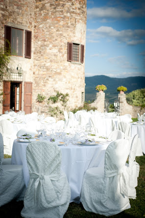
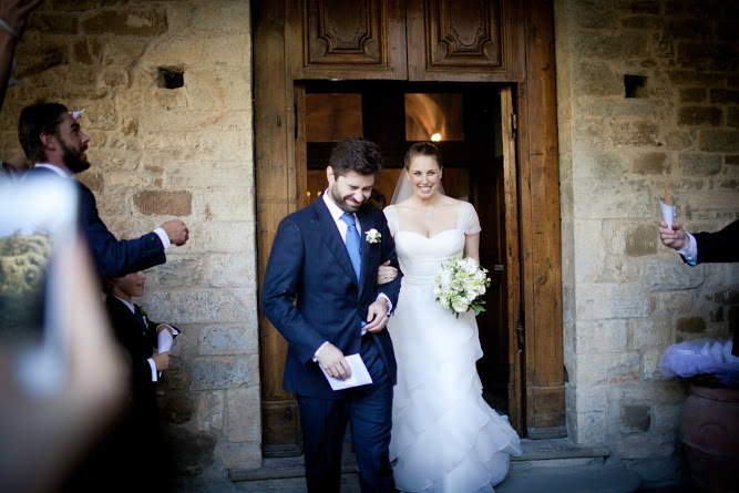
Recently I had the pleasure of traveling to Italy to attend the wedding of my good friends Jessica and Nicola. Set in heart of Chianti at Castello Gelsomino, the wedding was a romantic fete flanked by old world architecture and rolling hills.

Needless to say to anyone who has traveled to Italy (or anyone who has had the pleasure of seeing photographs), there’s never a need to overdue it when it comes to creating an atmosphere in a hotel, restaurant, or, in this case, a wedding reception. The castle at which the festivities were held gave perfectly for this type of event because of its beauty in addition to being one of the top Chianti wine producers in the region. After all, What’s a wedding without great wine?

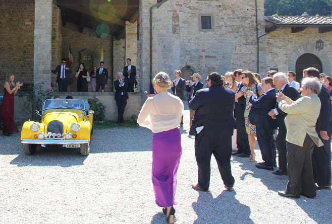
Married in a local abbey, Jessica and Nicola lead their guests back to the castle for a relaxing evening bathed in candlelight and baby’s breath. Greens, lilac and whites reflected throughout castle and which lent itself to beautiful photographs of a trip and evening I (and the happily married couple) will not soon forget.


An Inspiration

Designer Profile:

Kelly Wearstler

Kelly-W.png

We’ve all seen it before – clothing and accessories designer expands to include lush home line including everything from sheets to sofas, or visa versa. However, often times designers find themselves in a precarious situation – one in which the goal of expansion obviously somewhere got lost in translation reducing the integrity of their label that was once iconic and groundbreaking to mediocre displays at your local Macy’s. There are exceptions, of course, such as Versace or Missoni and most recently, Kelly Wearstler.

Born in South Carolina and a graduate of the Massachusetts College of Art, Wearstler began her career focusing on interior design. Wearstler’s distinctive style that mixes whimsy, sophistication and swank has been referred to as revolutionizing the look, feel and meaning of modern American glamour.

Perhaps her most famous and most frequently viewed project is that of the Avalon Hotel in Beverly Hills. Originally built in 1949 as the Beverly Carlton, the hotel was a home away from home for stars like Marilyn Monroe. Fifty years later, the oasis was renamed The Avalon for its 1999 reopening, after it was completely revamped by Wearstler.

In addition to commercial projects, Wearstler is sought after by some of the world’s most prominent people to lend her touch to the interiors of their homes. The New Yorker called Wearstler “the presiding grande dame of West Coast interior design.”

From books to collaborations with names like The Rug CompanyBergdorf Goodman and more recently, Lee Joffa, Wearstler has her hands in everything, and she does it well.

Wearstler recently debuted a collection of ready-to-wear, jewelry, furniture, home accessories and objects d’art and opening a 2,400 square-foot flagship boutique on Melrose Avenue in Los Angeles.

Though there is no question that I love the aesthetic of Kelly Wearstler and the many wonderful contributions she has made to the world of design, I think perhaps what I admire the most is the fact that she is a wonderful role model for women. Women like Wearstler remind us that there is no limit to our creativity and that about which we can dream.